
Logo Design
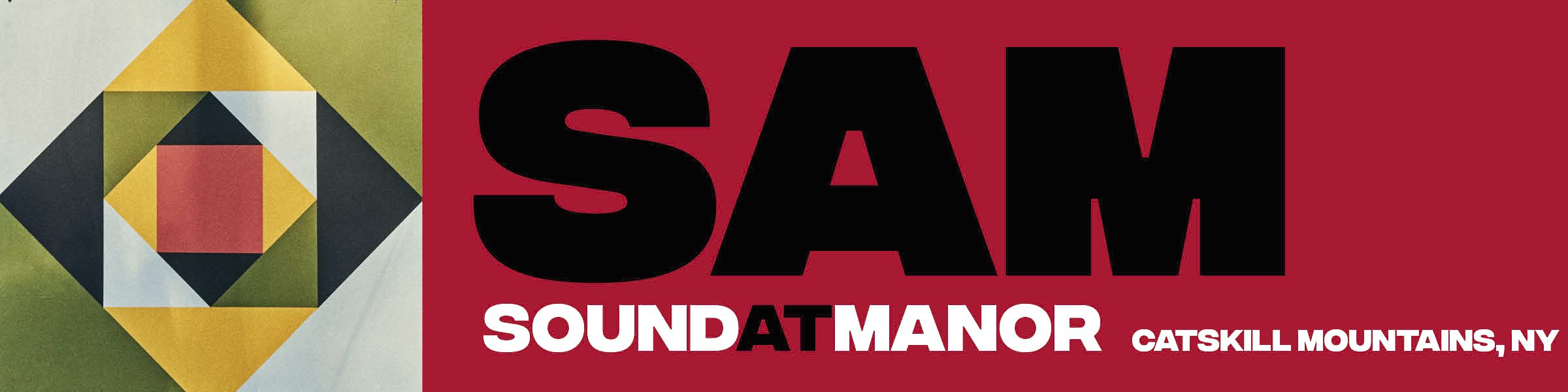
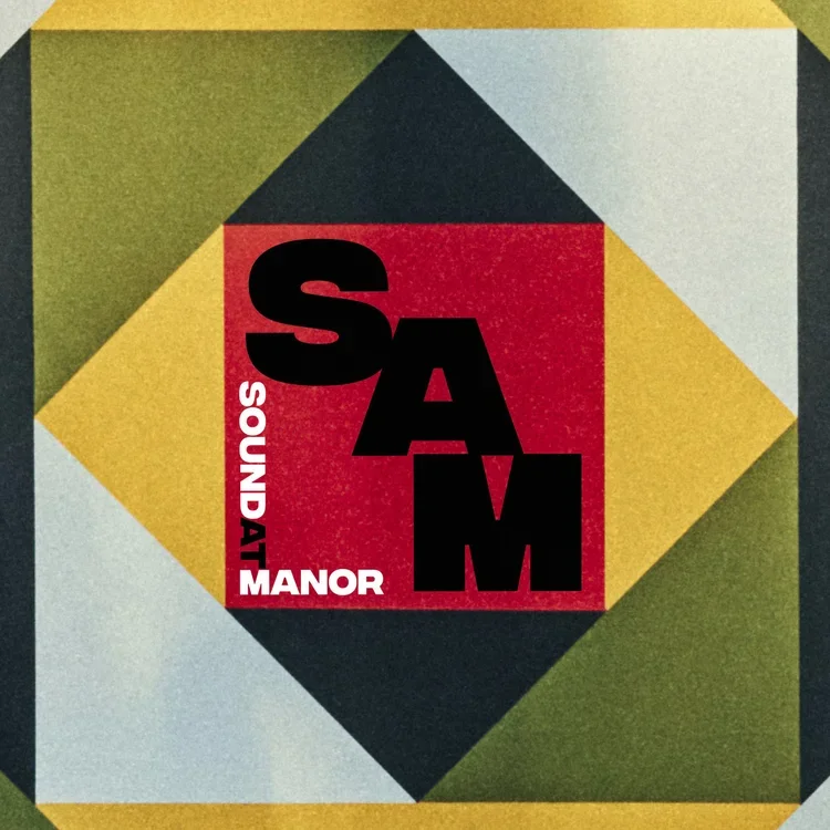
Oakley Munson’s recording studio in Livingston Manor, NY needed a brand identity. he was inspired by the designs of vintage 45’s, so we pulled together some mood boards, found a distinctive typeface, and used the iconic painted sign on his renovated barn turned recording studio to create this logo.
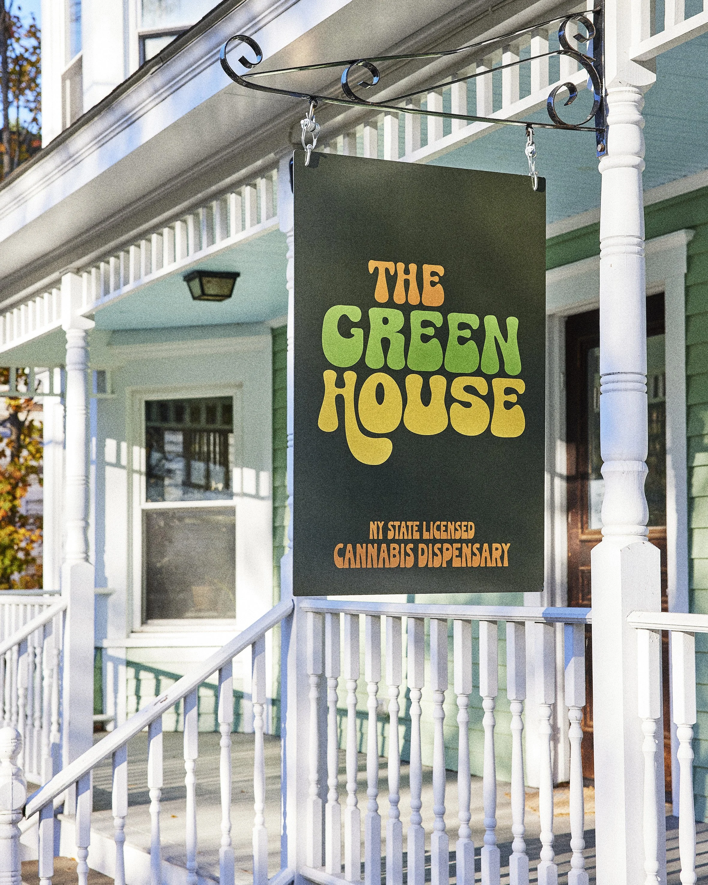
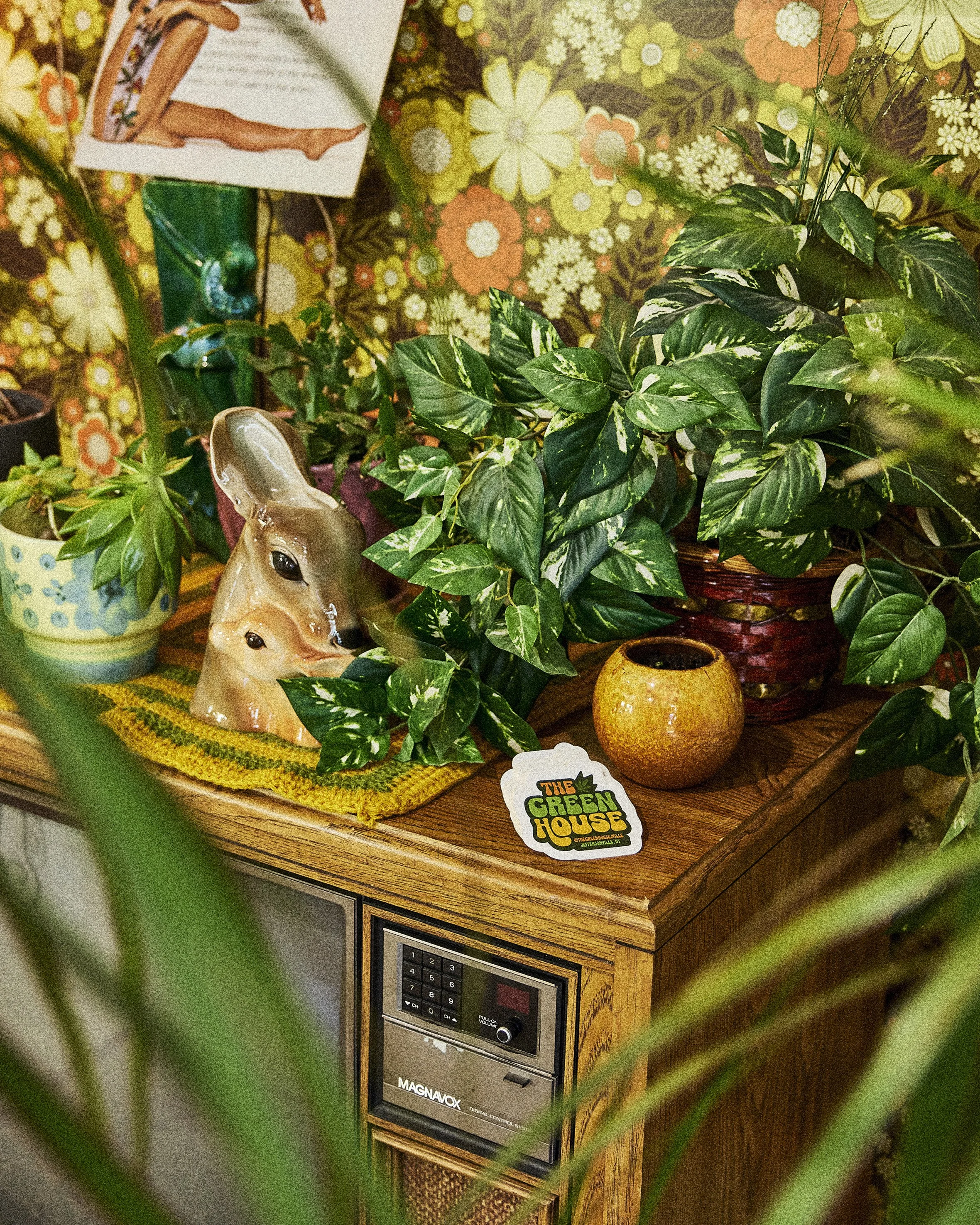
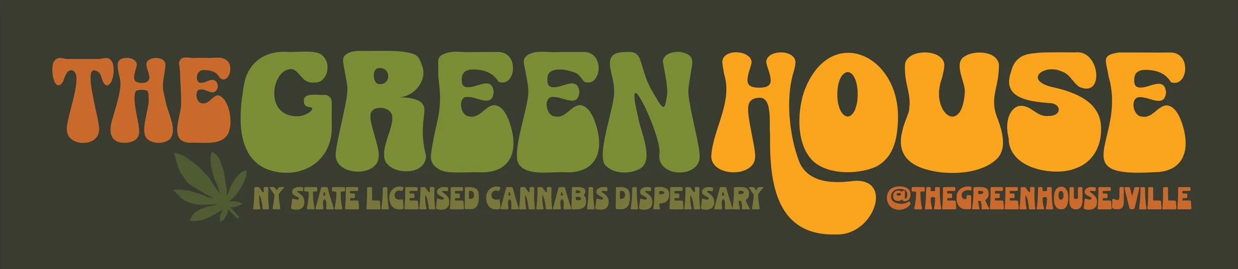
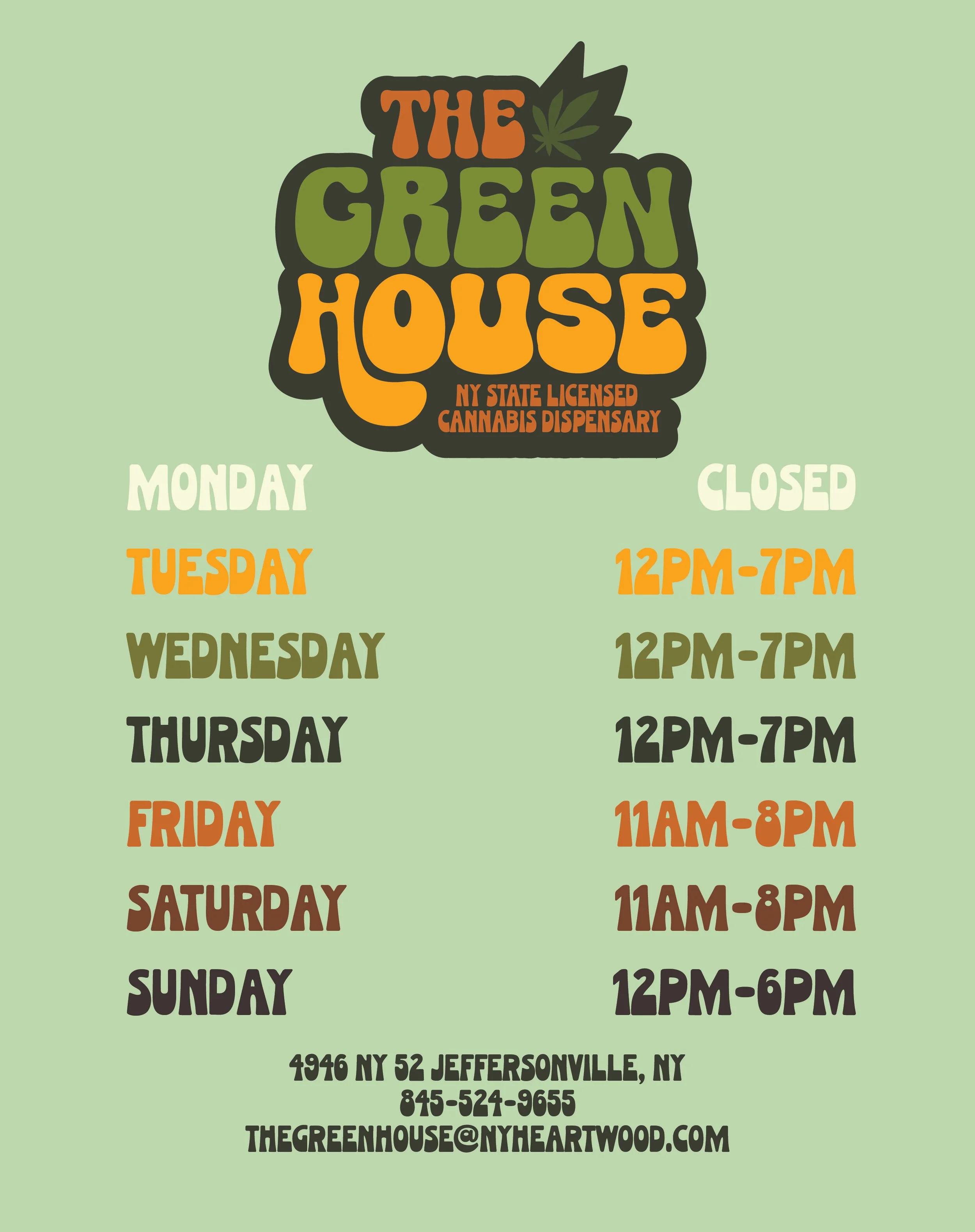
When Lauren Seikaly and Michael Huber opened their new cannabis dispensary in Jeffersonville, NY, they were going for a spirit of the 70’s meets the old woodstock days of this part of upstate new york. They wished to incorporate the iconic orange and green color palette of the era to match their vintage interior decor.
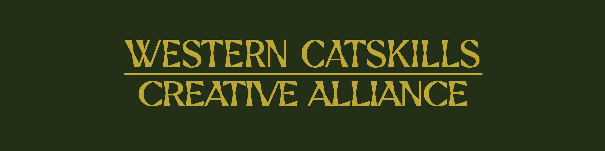
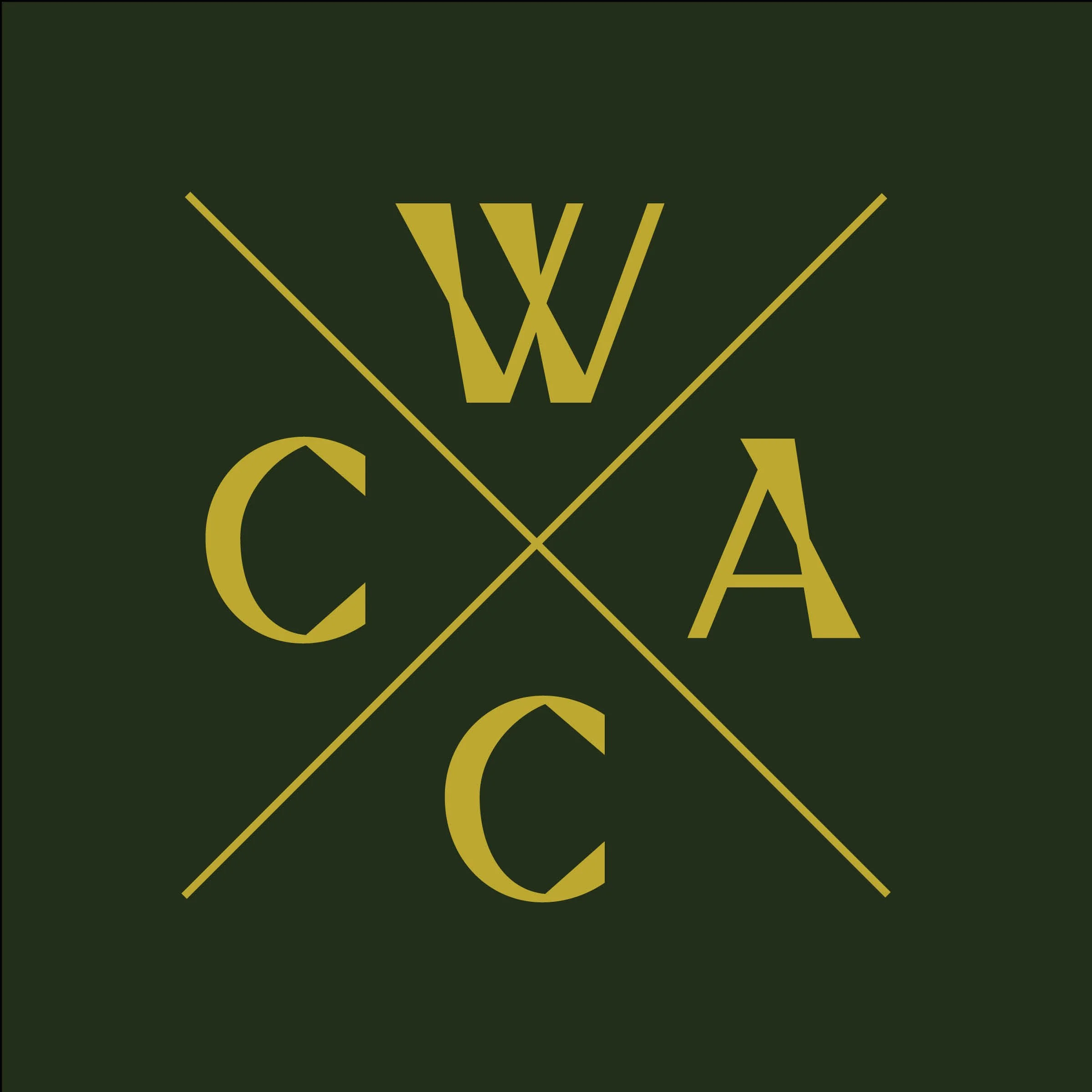
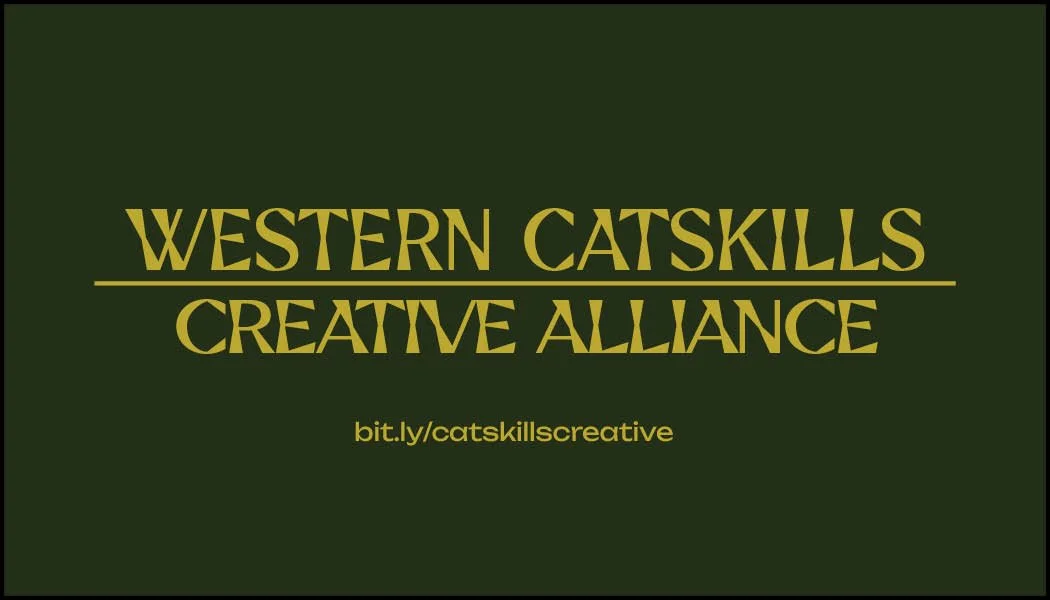
this logo for the Western Catskills Creative Alliance features angular display font and nods to the colors of Forest Ranger uniforms to evoke a creative and slightly quirky take on the Spirit of the catskills. The lettermark version borrows inspiration from union halls and trade associations of the mid-20th century and is a cheeky throwback to YLINHC.
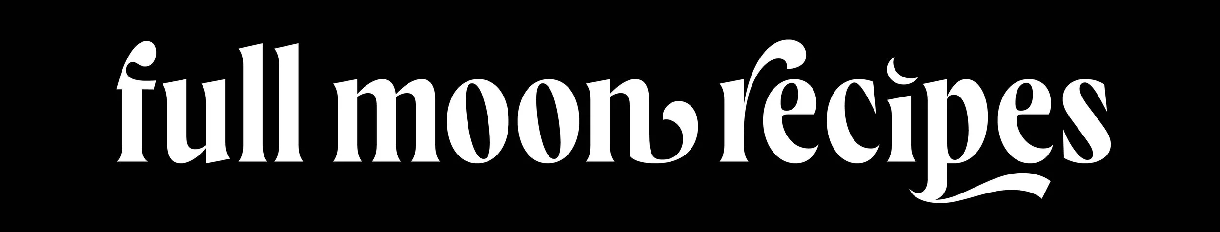
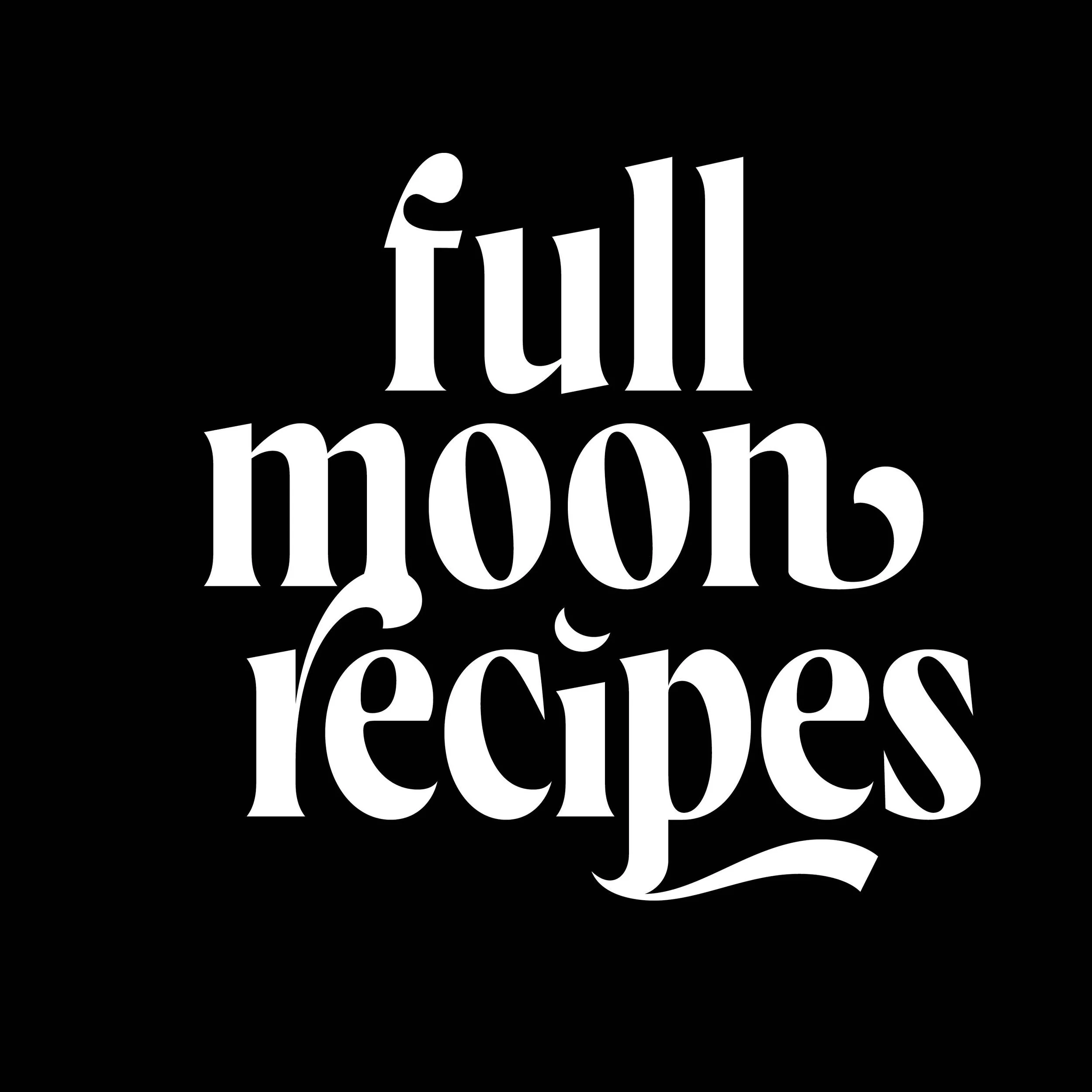
A substack Newsletter for connecting to the cycles of the moon, venerating the land and earth, and cooking seasonal recipes to become more in tune with nature. This logo was created by adjusting a typeface with flourishes and a crescent moon to mimic the flow of the elements.
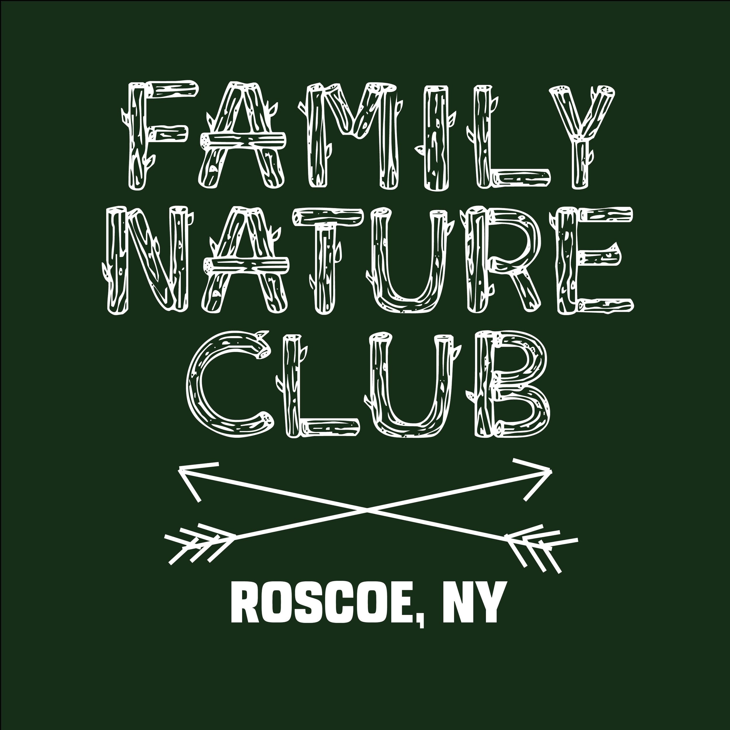
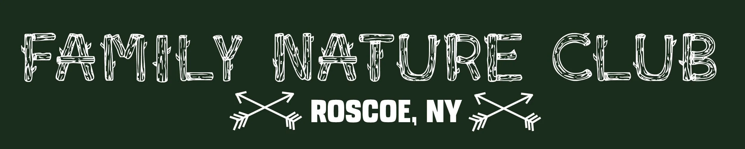
A nature club for getting families together for upstate adventures needed a kitschy scouts inspired logo. A fun, log flume typeface meets Hand drawn crossed arrows (friendship symbol) to evoke summer camp nostalgia.
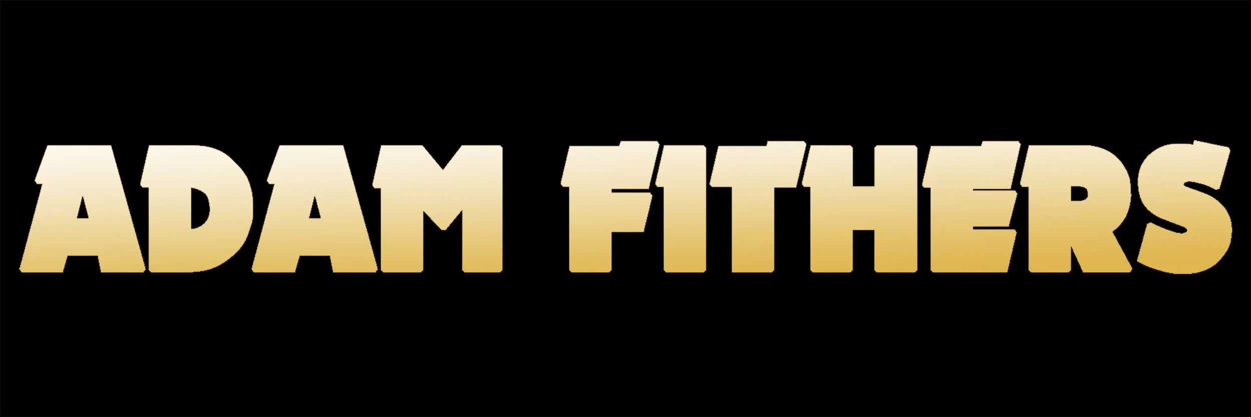
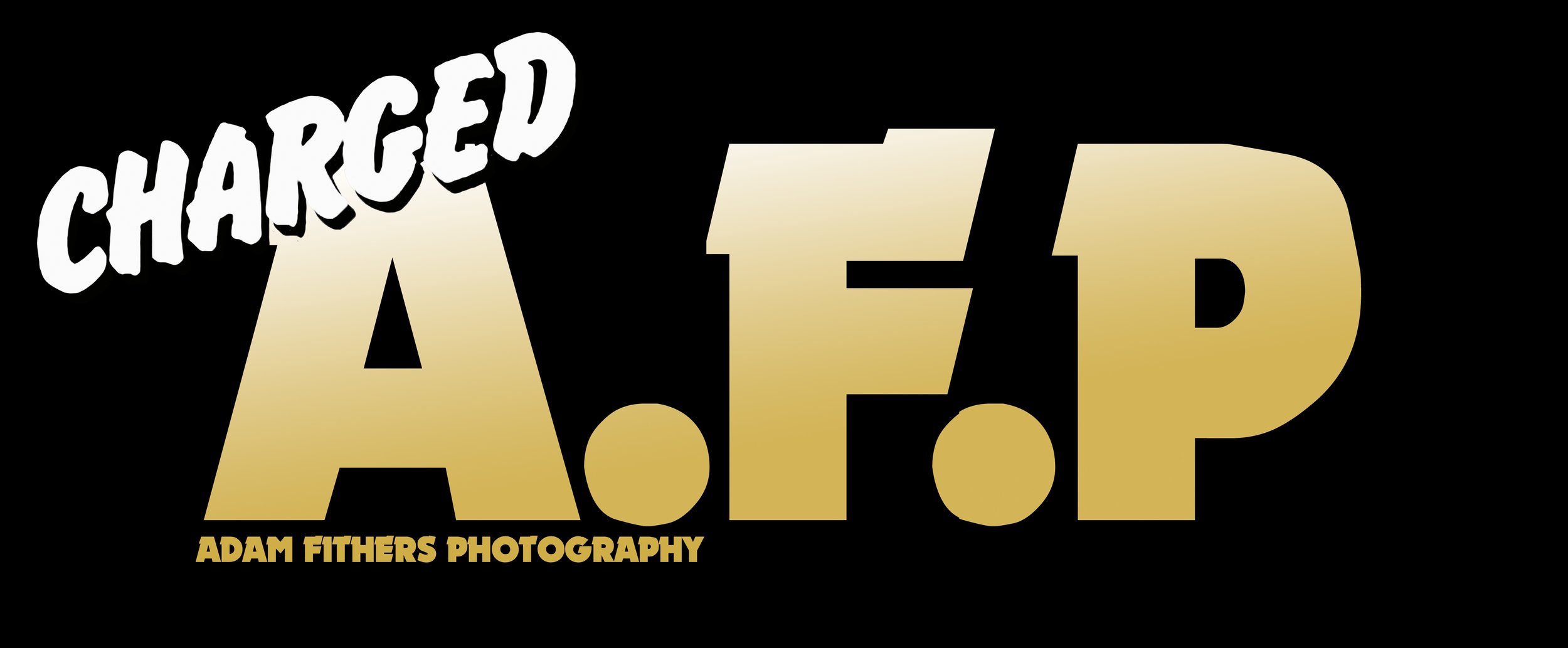
Adam Fithers made his commercial photography logo as An elite take on the UK82 punk aesthetic of studded leather and maximum rock n roll. it is Used for BRAND IDENTITY, STATIONERY, and equipment labels on set, bringing name recognition to his work with a lasting impression on his clients.
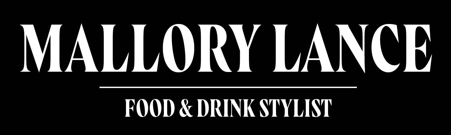
Mallory Lance’s food styling business needed an identity to match the dark, magical worlds she builds for editorial and commercial clients. the minimalist logo with a serif display typeface reflects the stark mysticism of her work.